

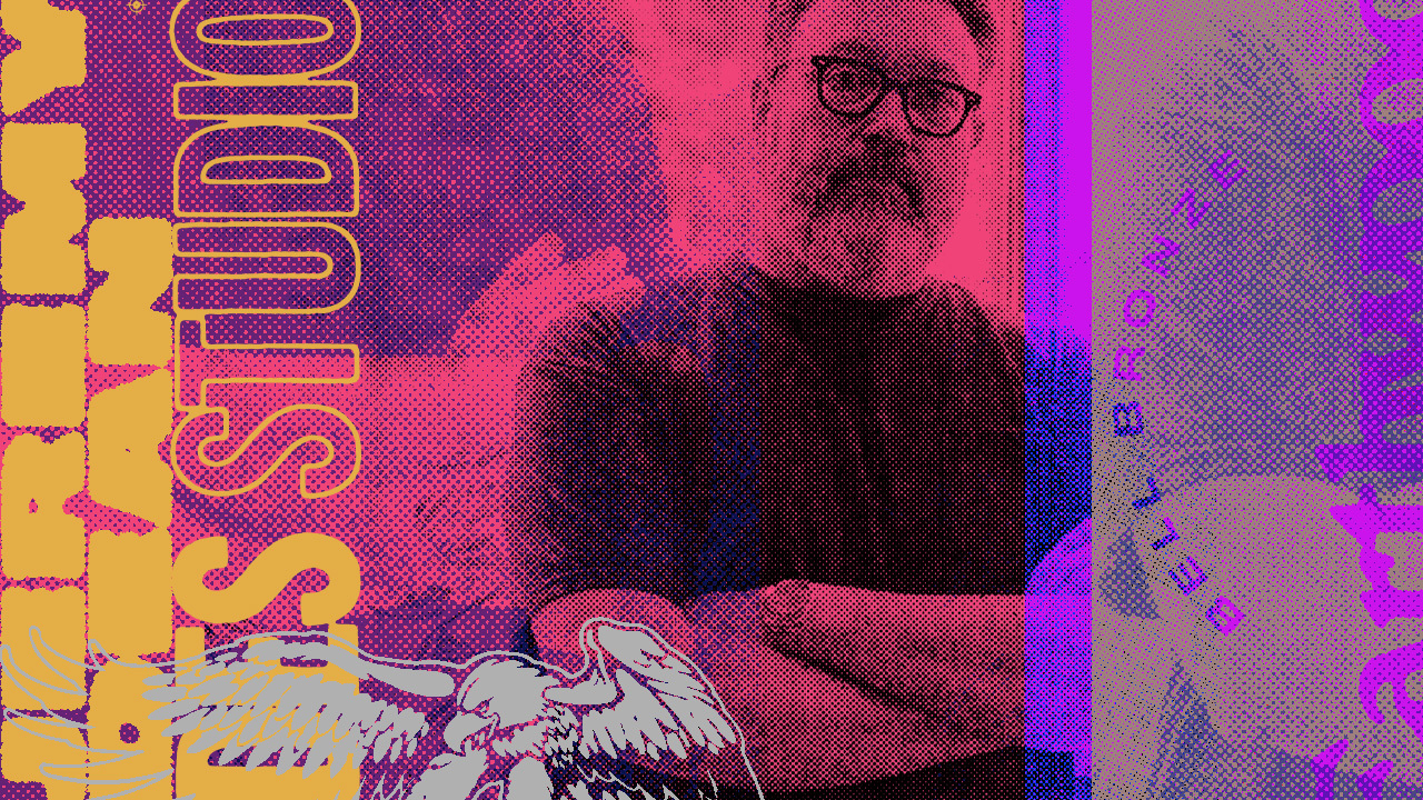
Ernie Ball has always prided itself on working with not only the world’s best musical artists but the world’s best visual artists too. Since 1962 we’ve brought our strings and products to life through next-level art, design, and color. In 2024 we continued that tradition by collaborating with Philadelphia-based artist Jeremy Dean on the design of John Mayer’s new signature acoustic strings. Our creative director, Chuck Anderson, sat down with Jeremy for a conversation about his early influences, his deep ties to music and subculture, and the full-circle journey that led him to Ernie Ball.
Chuck Anderson (Ernie Ball Creative Director and founder of nopattern.com), spoke with Jeremy about his background, creative process, and inspiration behind the latest Ernie Ball Bell Bronze.
Q & A WITH JEREMY DEAN
CA: To start us off, what have you been into lately outside of design?
JD: Honestly, I’ve fallen down the rabbit hole of vintage stereo equipment on Facebook Marketplace. I’ve never been a huge record collector—my collection’s always been more about the moments when I came across something special—but the past few years I’ve gotten deep into ’70s gear. Marantz, Sansui, JBL, Rogers Speakers. I love swapping components and hearing how different setups make familiar music sound completely new.
The wildest find was a pair of JBL L100 speakers my neighbor threw out after a flood. I’d been watching them on eBay for years, and suddenly they were just sitting across the street. Total score.
CA: What’s the test record when you plug in new equipment?
JD: The Police are a go-to. Sonically, those records are amazing. Coltrane, Miles, some Japanese jazz too—anything with space and detail. I’m not running a million-dollar system, but I love the game of chasing sound and realizing, “I’ve listened to this song for 30 years and never heard that before.”
CA: Music and art feel inseparable for so many of us. eWhat was the record cover that first lit the spark for you?
JD: No question: KISS’s Rock and Roll Over. I got it as a birthday gift when I was seven and it blew my mind. The makeup, the View-Master, the dolls—I was all in. The Police’s Ghost in the Machine cover too. KISS had that over-the-top, elaborate visual world, while The Police were clean and minimal. Those contrasts stuck with me.
CA: And then came the deeper dive into subculture?
JD: Yeah, it was skateboarding that cracked everything open. I finally got a “real” skateboard right before my 13th birthday, and that pulled me into Thrasher and Transworld. Suddenly I’m reading band reviews, seeing record covers, making connections. A friend’s older brother had a Dead Kennedys tape, and I was like, what is this? From there it was tapes, comps, trading stuff, just chasing it down. That whole skate/punk/hardcore ecosystem in the early ’80s shaped me.
CA: When did you first start making art for bands?
JD: In high school, really. Friends had a band, met a guy with a small label, and I ended up doing their record cover. Before that we’d done a zine together—I’d handle the covers and headers. Around the same time I started working summers at my dad’s printing company. The designers there showed me how to make blue-line mechanicals, use stat cameras, all that old-school production stuff. I’d bug them constantly, but they were generous with their time. That hands-on, analog side of design hooked me early.
CA: What about your first paid gig?
JD: That was the Crackhouse font I designed, released by House Industries when I was 21. They cut me in on royalties, which was huge. That was the first time I thought, “Okay, maybe this can be a career.”

CA: Fast forward a bit—you became a fixture in the music world, especially with Jade Tree Records.
JD: Yeah, meeting Tim and Darren at Jade Tree was a turning point. They were based in Wilmington, Delaware, near the House Industries office, so there was a natural connection. I wanted to design record covers, and they gave me a shot. The first big one was Kid Dynamite. I ended up doing pretty much everything for them—records, merch, the works. Then it was Turing Machine, The Explosion, Strike Anywhere…
CA: Those designs hit me hard as a young designer. Jade Tree felt different—subtle typography, real design sensibility applied to aggressive music. It stood out from the “loud music = loud visuals” formula. And everything about that era’s aesthetic pendulum has swung into full acceptance now by Gen Z.
JD: I had done work on Jets to Brazil t-shirts but what’s funny is my kids have now discovered all that stuff without me. They’ll be like, dad you did a Jets to Brazil tshirt that looks like the PanAm logo right? (Laughs). I still have the faxes asking me for that design. I still have some of those in the attic. That was when I really figured out how I fit into this whole world, because I’m not a musician, so that was the way I got to stay connected.
CA: These days a lot of people know you from working with John Mayer. How did that relationship start?
JD: Believe it or not, he DM’d me about the Black Flag parody shirts I made (Jeremy’s project Wonders of Black Flag that combines Grateful Dead and Black Flag imagery). At first I thought it was a fake account. Next thing I know, he’s inviting me to meet before a Dead & Co. show. We hit it off, and it’s been a natural collaboration since.
CA: What was the first project?
JD: The single art for Love on the Weekend. Then it snowballed—album packaging, merch, tour visuals. John’s incredibly hands-on. We’ll text or jump on a call for 30 minutes and hammer things out directly. It’s so refreshing—no layers of management, just ideas bouncing back and forth.
CA: What’s your current balance of personal vs. commercial work?
JD: I’d say around 50% commercial, 25% band posters, 25% personal work. I need that personal time to explore new styles or directions. I can get bored if I do ten gig posters in a row, you know? I actually really like the back-and-forth with a good client. Feedback helps evolve the work, even if you don’t see it right away. I think you should cherish good feedback.
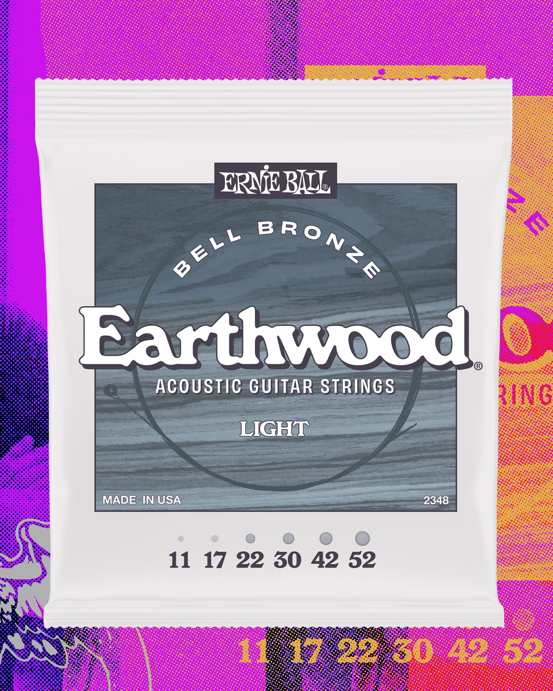
CA: That collaboration eventually led to the Ernie Ball Bell Bronze project with John. Designing string packaging is unique—it’s not just about showing the strings themselves, but about capturing the sound and feel. How did you approach it?
JD: Exactly. If you’re just looking at strings on a guitar, they all appear similar. The challenge is finding a way to visually express their voice—the tone and feel they bring out when someone plays them. John came in with a vision, and together with him and Brian Ball at Ernie Ball we honed it. The type, the imagery, the details all had to feel like John, feel like Ernie Ball, feel acoustic.
It was a labor of love. You only get one chance to launch a new string, and I wanted it to have that timeless quality. Because who knows? Twenty years from now, some kid might say, “I started playing guitar because of those strings and that design.” That’s the power of this stuff.
CA: I love that parallel—you grow up on KISS covers, end up designing and making art for so many great bands, then John Mayer’s Earthwood Bell Bronze strings for Ernie Ball. It’s all very connected.
JD: Exactly. I think about that a lot. Everybody I knew that played an instrument had a neon Ernie Ball sticker on a case or whatever, so it’s burning into your brain. I would definitely say that a heritage brand is always exciting to work with because its history, it holds a special place in culture.